Symmetry can make a logo feel stable and memorable, but optical balance matters more than perfect geometry. Learn when symmetry, asymmetry, and correction work best.
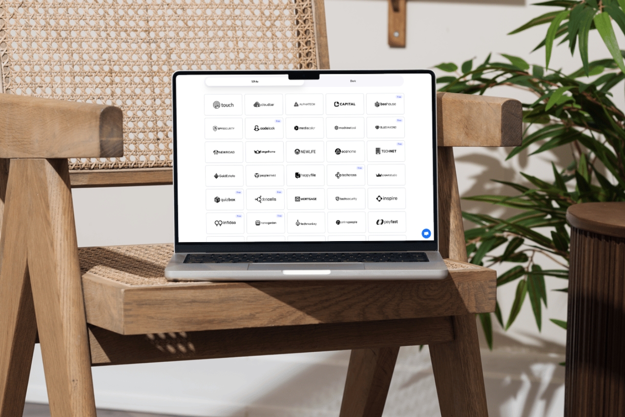
Symmetry is useful when a logo needs to feel stable, ordered, and easy to recognize—but perfect mathematical symmetry is not a requirement for a strong mark. Optical balance matters more than whether both halves are identical.
Mirrored or rotational structures are easy for the eye to process. That can make a symbol feel calm, established, and deliberate, which is useful for industries where trust or precision matters.
Letterforms, curves, negative space, and visual weight do not always behave mathematically. A shape may need to be shifted slightly off center or scaled unevenly to look centered to the eye.
Designers often make these optical corrections in typography and icon systems. Logos benefit from the same judgment.
A deliberately uneven composition can feel faster, more editorial, playful, or expressive. The goal is not disorder; it is balance created through different weights rather than mirrored forms.
Reduce the logo to one color and view it at a small size. If the overall silhouette remains clear and balanced, the structure is doing useful work without relying on color or effects.
Symmetrical outer shapes can contain awkward inner gaps. Check the spaces between forms, not only the forms themselves. A visually even negative space often matters more than matching measurements.
Use symmetry as a design tool, not a rule. Start with a clear idea, then correct the geometry until the mark feels balanced at the sizes and contexts where people will actually see it.






Don’t miss out on our superb, customizable templates designed to enhance your web design experience. We constantly add new templates and components.

Explore stunning Webflow, Framer, HTML5, Next.js and Figma templates designed to spark your next big idea.


*Rest assured that your data is safe with us, and you'll only hear from us 1 time per month.