Responsive layouts are only the start. Test mobile navigation, touch targets, forms, media, performance, content priority, and real-device behavior before launch.
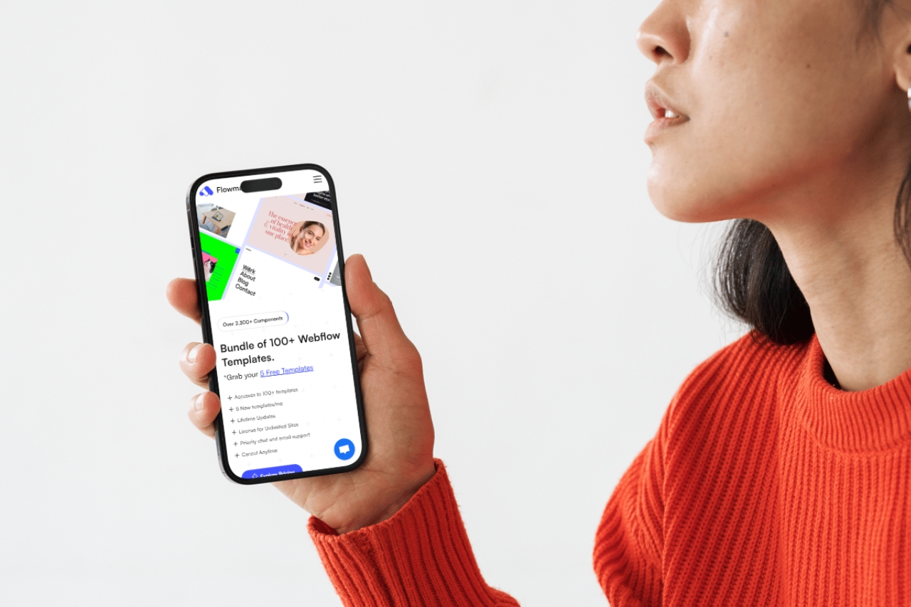
A responsive layout is not automatically a good mobile experience. A site can fit a small screen and still be frustrating because navigation is awkward, tap targets are too small, forms are painful, media is heavy, or important content is buried.
Ask what a visitor is most likely to do from a phone: call, book, compare pricing, view work, find a location, read an article, or submit a form. The mobile layout should make those tasks obvious without forcing the visitor through desktop-oriented decoration first.
Hover states do not translate directly to touch. Make sure every important navigation path works with taps, the menu can be closed easily, and nested items are not dependent on precise pointer behavior.
Check sticky headers too. A navigation bar that feels compact on desktop can consume a large percentage of a small screen.
Buttons, links, filter chips, slider controls, accordions, and form inputs need enough size and separation to use comfortably. Crowded controls create accidental taps even when the visual design technically fits.
Demo copy is usually short. Real service names, project titles, pricing labels, and legal text can wrap very differently. Replace representative content early and test the layout at several widths rather than only one phone preset.
Forms are often where mobile conversion breaks. Keep the number of fields proportional to the value of the action, use clear labels, provide sensible input types, and make errors easy to understand.
If a form is used for leads or bookings, complete it yourself on a phone before launch.
A large desktop video or image may add little value on mobile while consuming bandwidth and pushing the useful content down the page. Review image crops, video autoplay, background media, sliders, and embeds independently for mobile.
For image-heavy sites, see the Webflow performance guide.
Try stacking, reordering, simplifying decoration, or reducing motion before removing content. If information is important enough to appear on desktop, it is often important to mobile visitors too.
Analytics, consent tools, chat widgets, video embeds, schedulers, and marketing scripts can change the production experience substantially. Test after the real integrations are live, not only on the clean template.
Good mobile design is about priority, touch, speed, and context as much as breakpoint styling. For the Webflow-specific cascade and layout workflow, read how Webflow breakpoints really work.




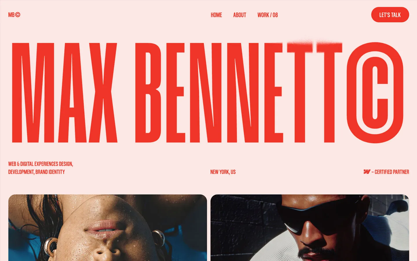


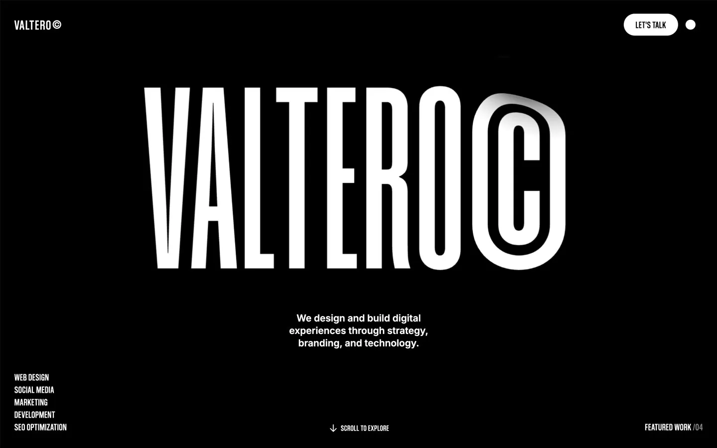
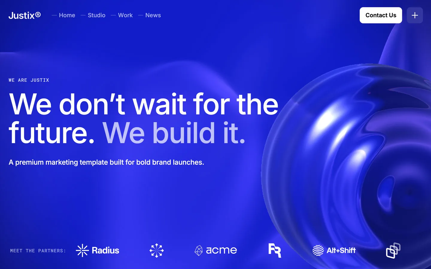


Don’t miss out on our superb, customizable templates designed to enhance your web design experience. We constantly add new templates and components.

Explore stunning Webflow, Framer, HTML5, Next.js and Figma templates designed to spark your next big idea.


*Rest assured that your data is safe with us, and you'll only hear from us 1 time per month.